Education Analytics Dashboard
A dashboard designed for school administrators to track student engagement, collaboration, and technology adoption across Google Workspace and Office 365 in real-time.
ROLE
Lead Product Designer
Faster reporting and decision-making
Weeks from research to prototypes
Enhanced visibility into tech adoption
The Challenge
School administrators struggled to understand how students and teachers were actually using Google Workspace and Office 365. Our client, a leading Instructional Management Suite provider, needed an analytics dashboard that could transform complex usage data into clear, actionable insights that drive educational outcomes. The company recognized the user experience and interface of analytic software as significant selling points.
Key objectives included:
- Visualizing digital adoption results
- Providing actionable data on learner engagement, collaboration, and device usage
- Enabling data-driven conversations to guide school improvement plans
- Measuring return on investment in educational technology
- Informing strategic planning and professional development initiatives
The Process And Insights
Understanding What School Leaders Need
We conducted in-depth interviews with school teachers, principals, and district leaders to understand their daily challenges and decision-making processes. The research revealed a critical gap—administrators needed immediate access to student engagement data from day one of Google Workspace or Office 365 implementation, but existing tools provided only surface-level metrics without context or actionable recommendations.
User Profiling and User Journeys
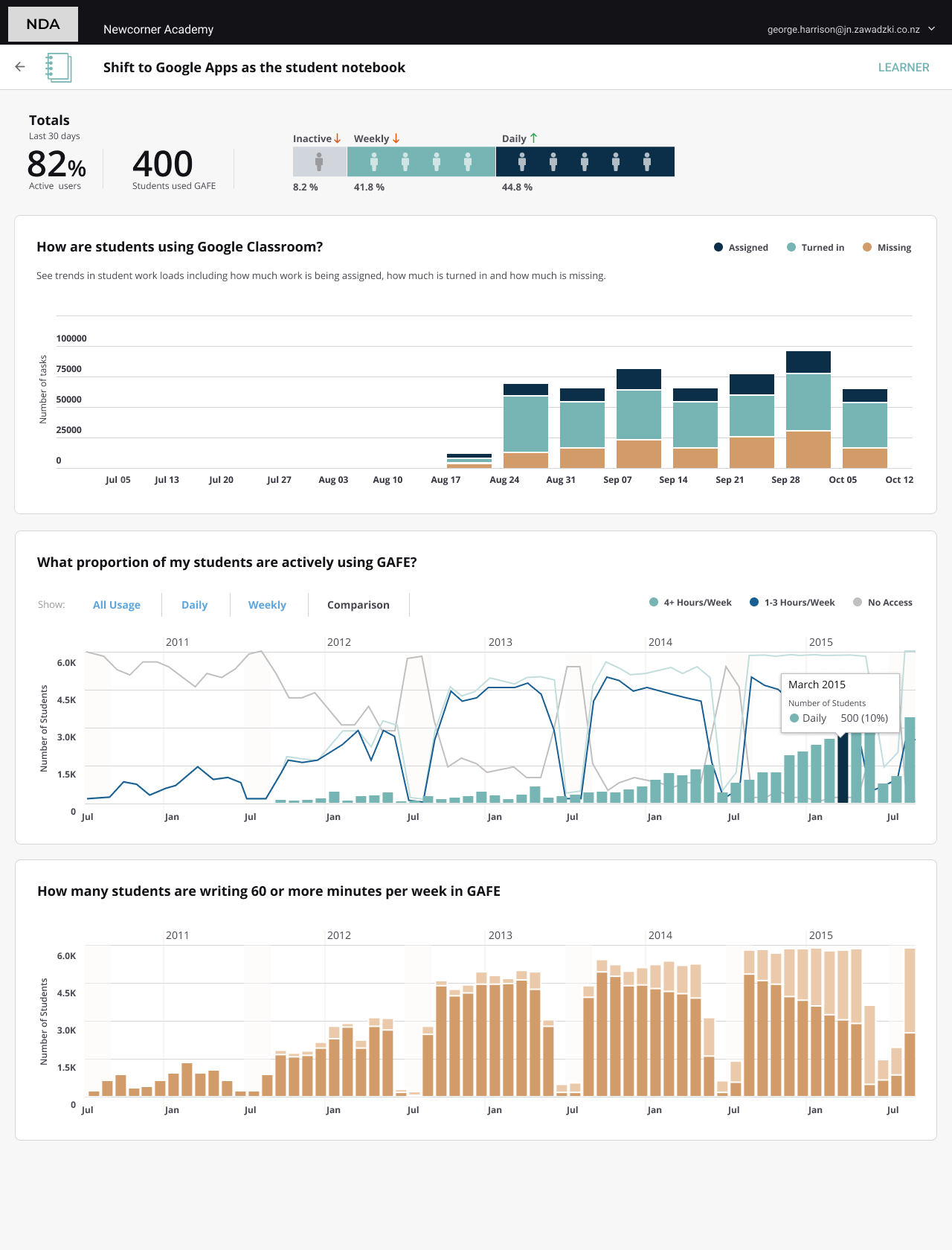
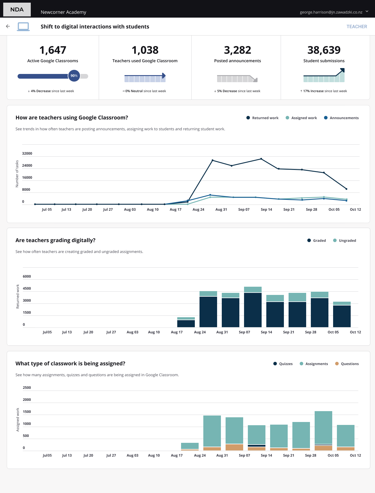
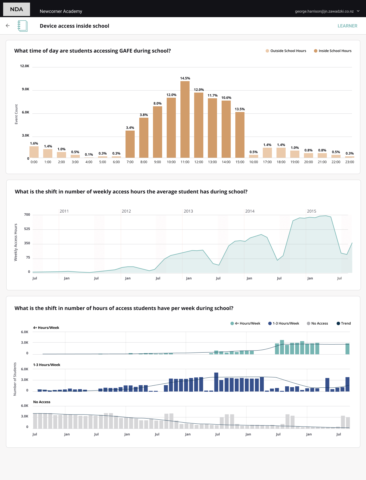
We profiled the user groups and mapped out a user journey to ensure that the experience we were creating was streamlined and tasks were easy to accomplish. Each target group needed to see different insights. The key step was to define what data to show to different personas, filtered by school and/or grade with insights by student demographics: gender, ethnicity, or key socio-economic and learning need indicators.
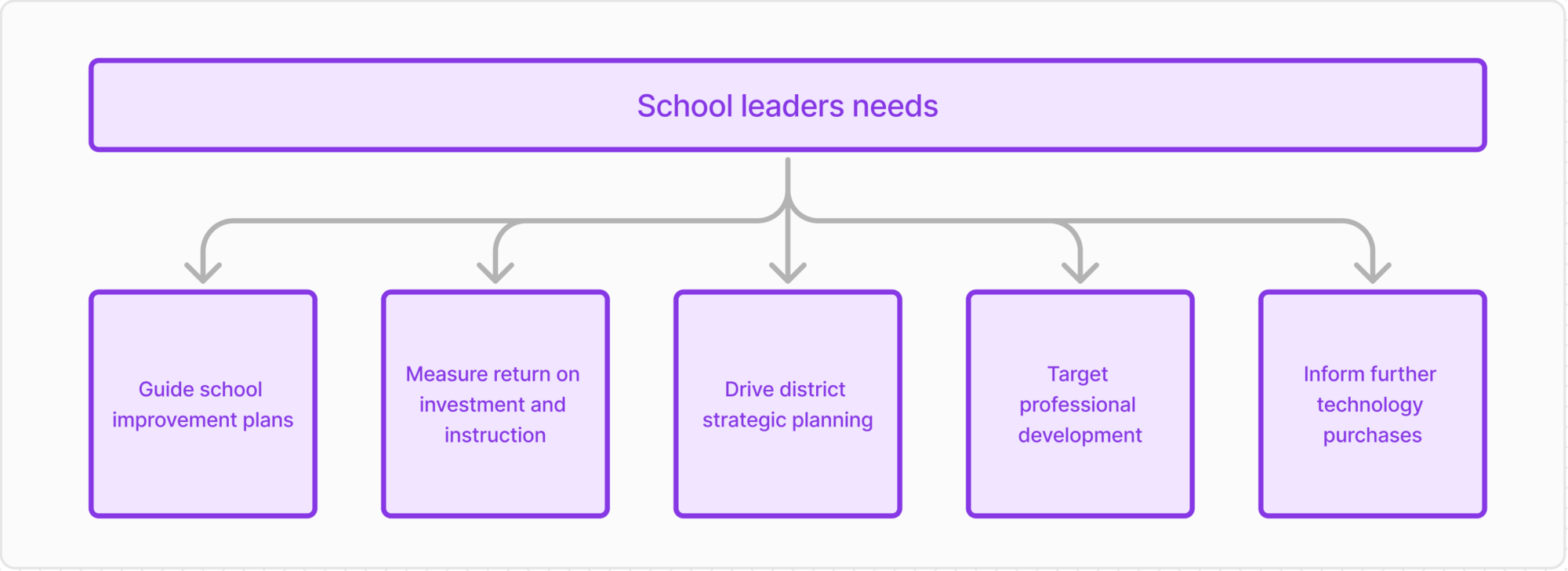
School leaders wanted to use the Analytics Dashboard to drive powerful teaching and learning conversations with current, objective data. This data would guide school improvement plans, measure return on investment and instruction, drive district strategic planning, target professional development, and inform further technology purchases.
Data Visualisation and Prototyping
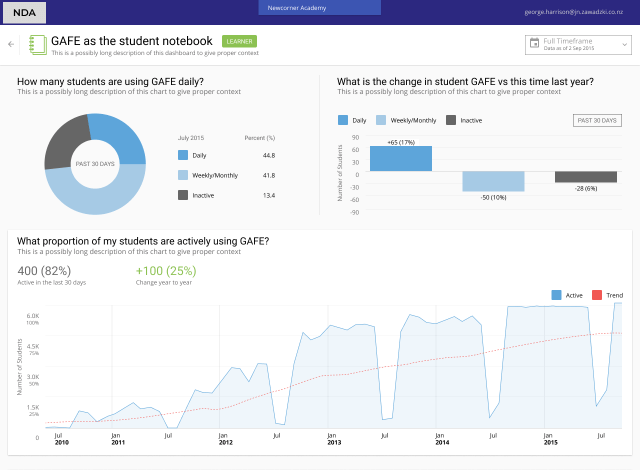
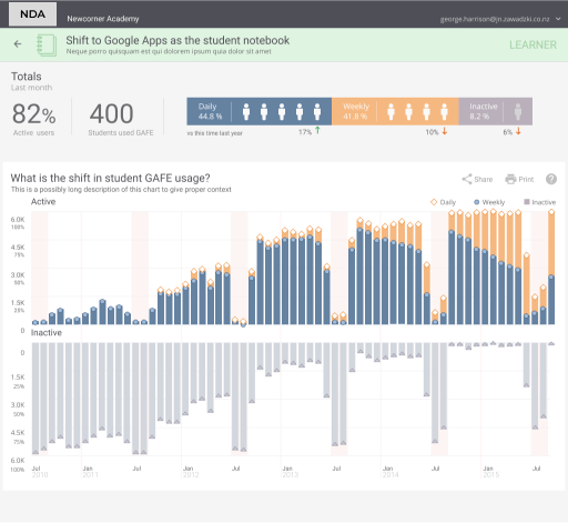
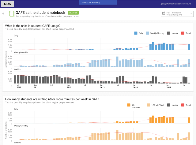
After identifying the most critical data for each target group, we created and tested several iterations of data visualizations with users. We developed a clickable prototype, refining the layout, functionality, and data presentation based on user feedback.
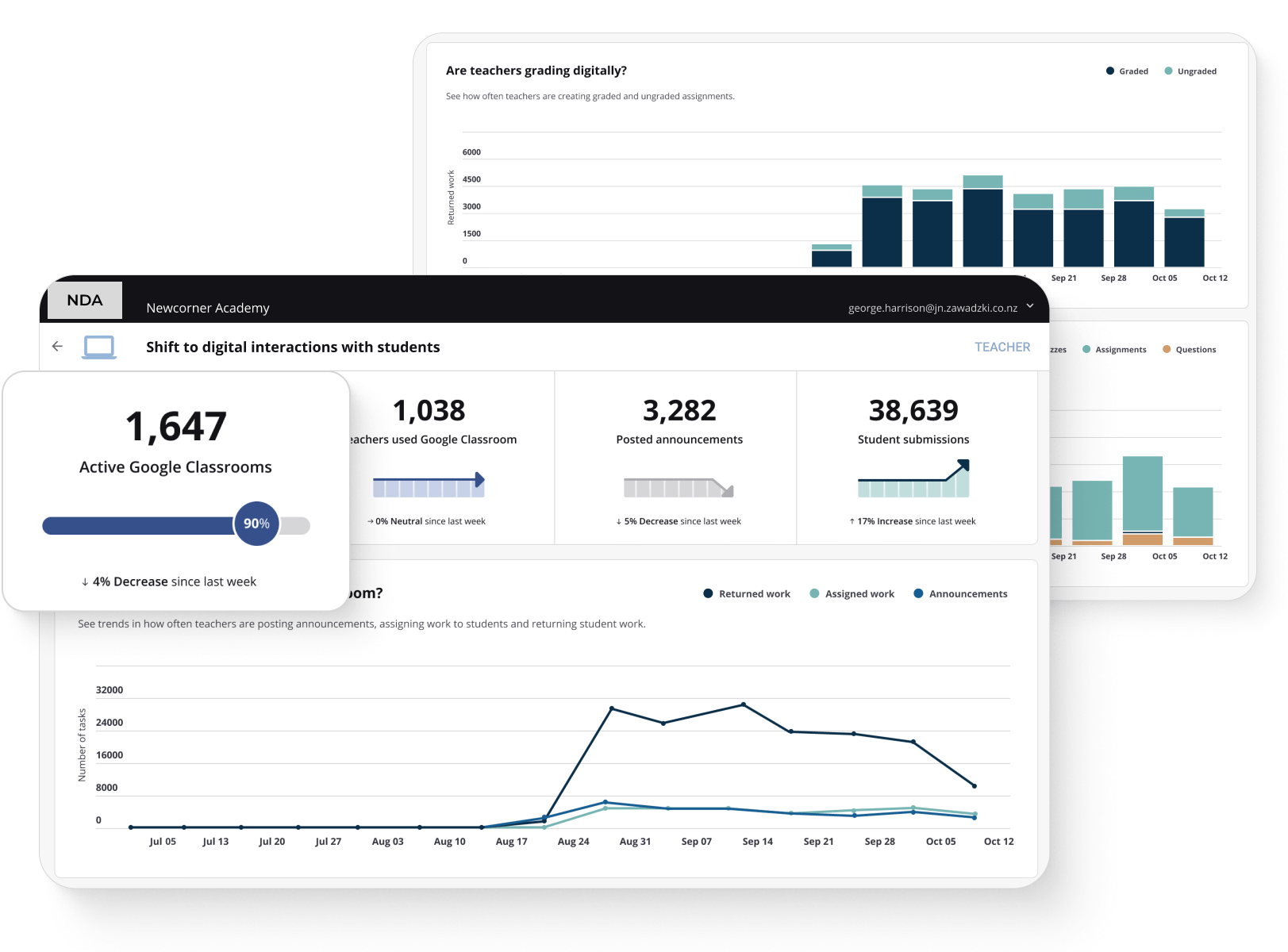
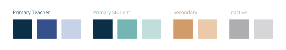
Our colour palette was carefully chosen to aid quick information digestion and retention. We used distinct primary colours for teacher-related and student-related data to facilitate rapid comprehension.
Several iterations for data visualisation were tested with users.
From Complex Data to Clear Insights
We delivered an analytics dashboard that transforms raw Google Workspace and Office 365 usage data into a strategic tool for improving educational outcomes. The complete design—from initial research to high-fidelity prototypes—was delivered in just six weeks, enabling rapid development and deployment.
How the dashboard solves key problems:
- Privacy-first installation: No student data exposure or compliance risks
- Role-based dashboards: Teachers, principals, and district leaders each see relevant metrics
- Visual clarity: Color-coded data visualization makes patterns immediately recognizable
- Actionable insights: Every metric connects to a specific improvement action
The result: School administrators can now identify struggling students, measure technology ROI, and make evidence-based decisions in minutes instead of weeks—all without disrupting their existing workflow.
Impact and Benefits
The B2B Analytics Dashboard offers numerous advantages to educational institutions:
- 1. Enhanced visibility into technology adoption and usage
- 2. Data-driven insights to guide strategic planning and professional development
- 3. Improved return on investment in educational technology
- 4. Streamlined reporting and decision-making processes
- 5. Ability to identify and address engagement gaps quickly