Financial Wellbeing for Enterprise Banking
Adapting money management features to different financial literacy levels without forcing everyone down the same path.
ROLE
Lead UX Designer
TIMELINE
6 months
TEAM
CX Designers, UX Writer, 2 Mid UX Designers, Accessibility Specialist, Product Owner
monthly active users (36% increase)
customers engaged with budgeting insights
digitally active customers (5% YoY growth)
Australia's banking app (Good Design Award)
One of Australia's largest banks serves over 6 million customers through its mobile banking app, trusted for everyday banking and financial insights.
The Money Management project introduced financial wellbeing features including Spend Analysis and Account Aggregation.
The bet was that if we designed tools that adapted to different financial literacy levels instead of forcing everyone down the same path, we could increase engagement across all customer segments while reducing overwhelm for anxious users.
Making complexity optional
Working within a 6-month timeline and legacy app infrastructure, I designed an experience that worked for everyone from anxious first-time users to financially savvy customers managing complex accounts. The challenge was serving this range without building three separate products.
Three personas were defined based on varying levels of financial literacy:
- The Overwhelmed - anxious about money, needing simple tools
- The Determined - wanting to improve finances and understand patterns
- The Proactive - managing complex finances across multiple accounts
I needed to design tools that worked for all three groups without forcing everyone down the same path. Four core principles guided the approach:
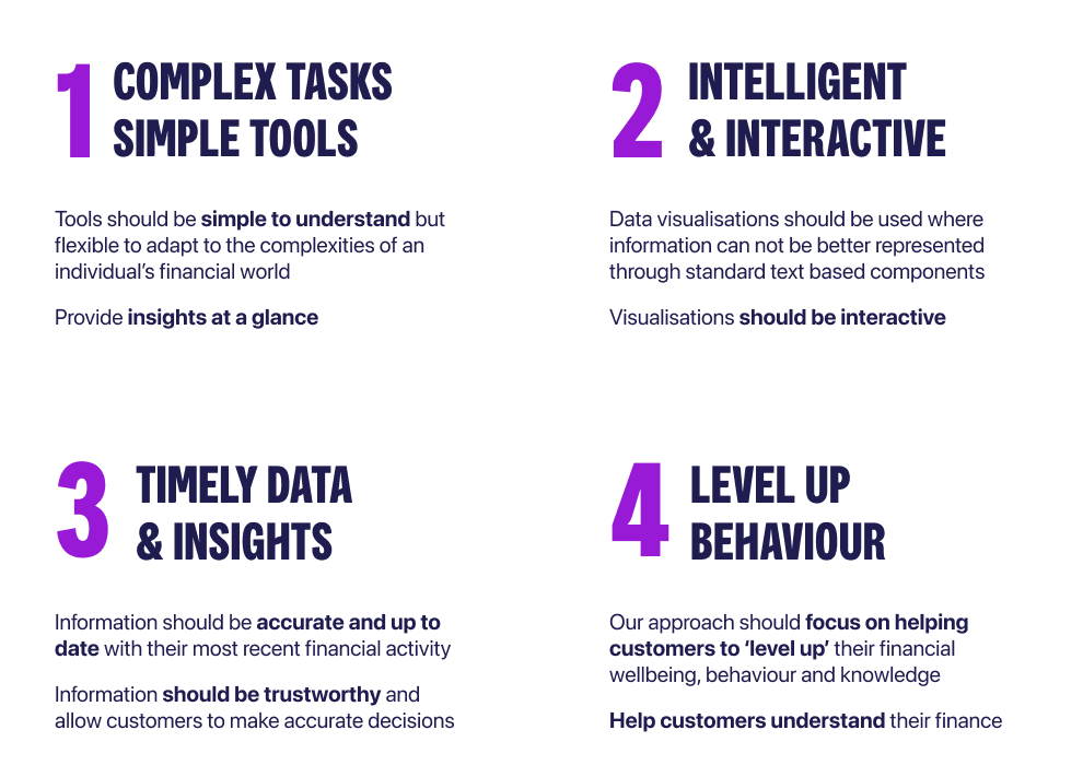
Understanding what customers needed
The CX team had gathered feedback that pointed in two opposite directions. Beginners wanted simpler tools, while advanced users wanted more control.
Rather than pick one segment to optimize for, I decided to make complexity optional through progressive disclosure.
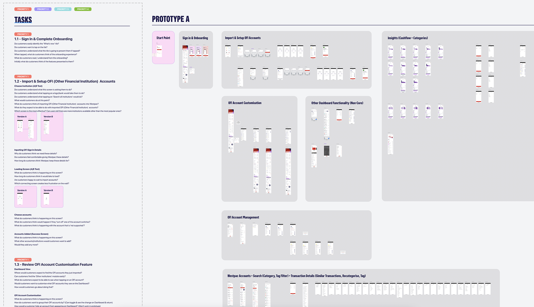
We reviewed existing customer feedback and analyzed previous versions of money management tools. This helped us understand what customers expected, where they struggled, and what needed to improve.
I built an information architecture mapping existing features and then proposed new ones to see how everything would connect together. This became our alignment tool with engineering and stakeholders, helping everyone see how the layered approach would work without building three separate experiences.
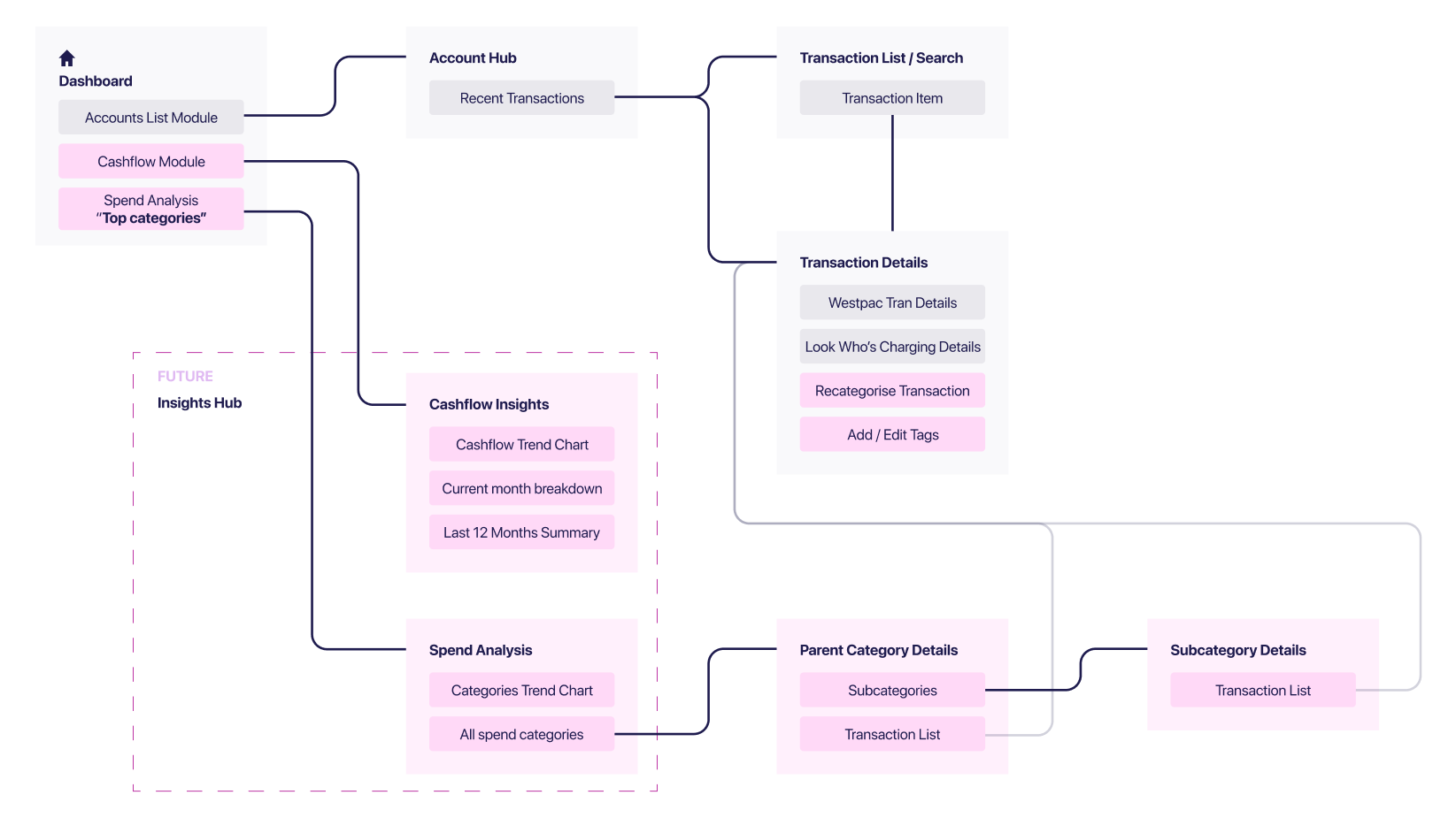
Designing cashflow for clarity
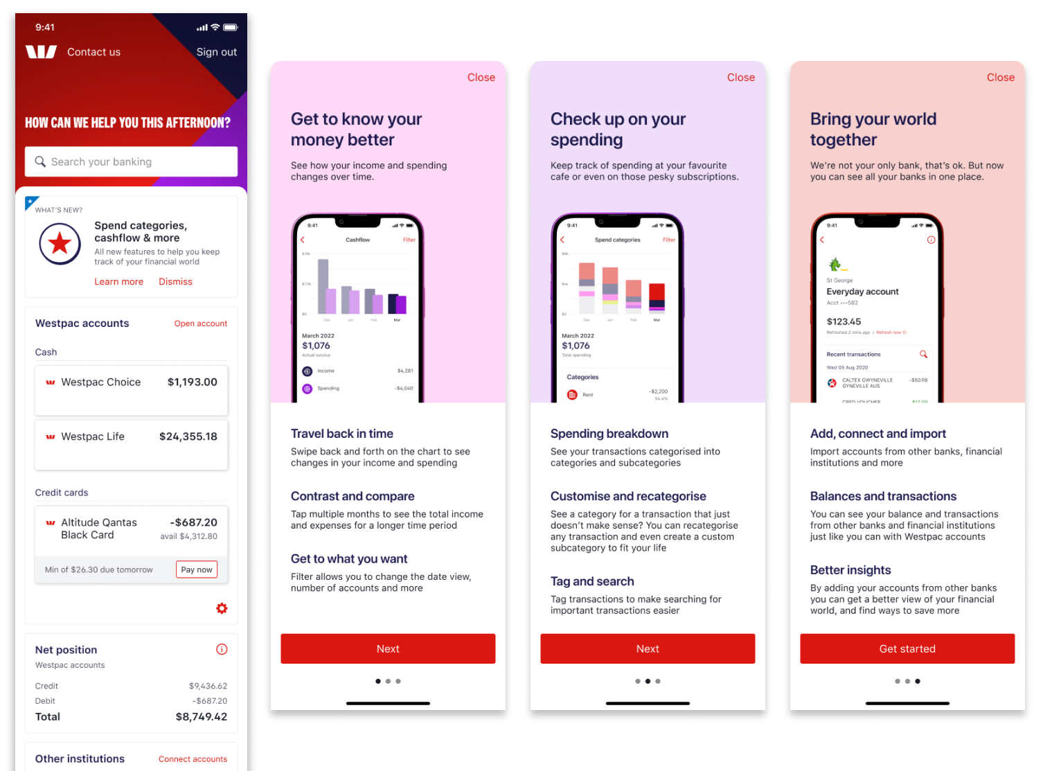
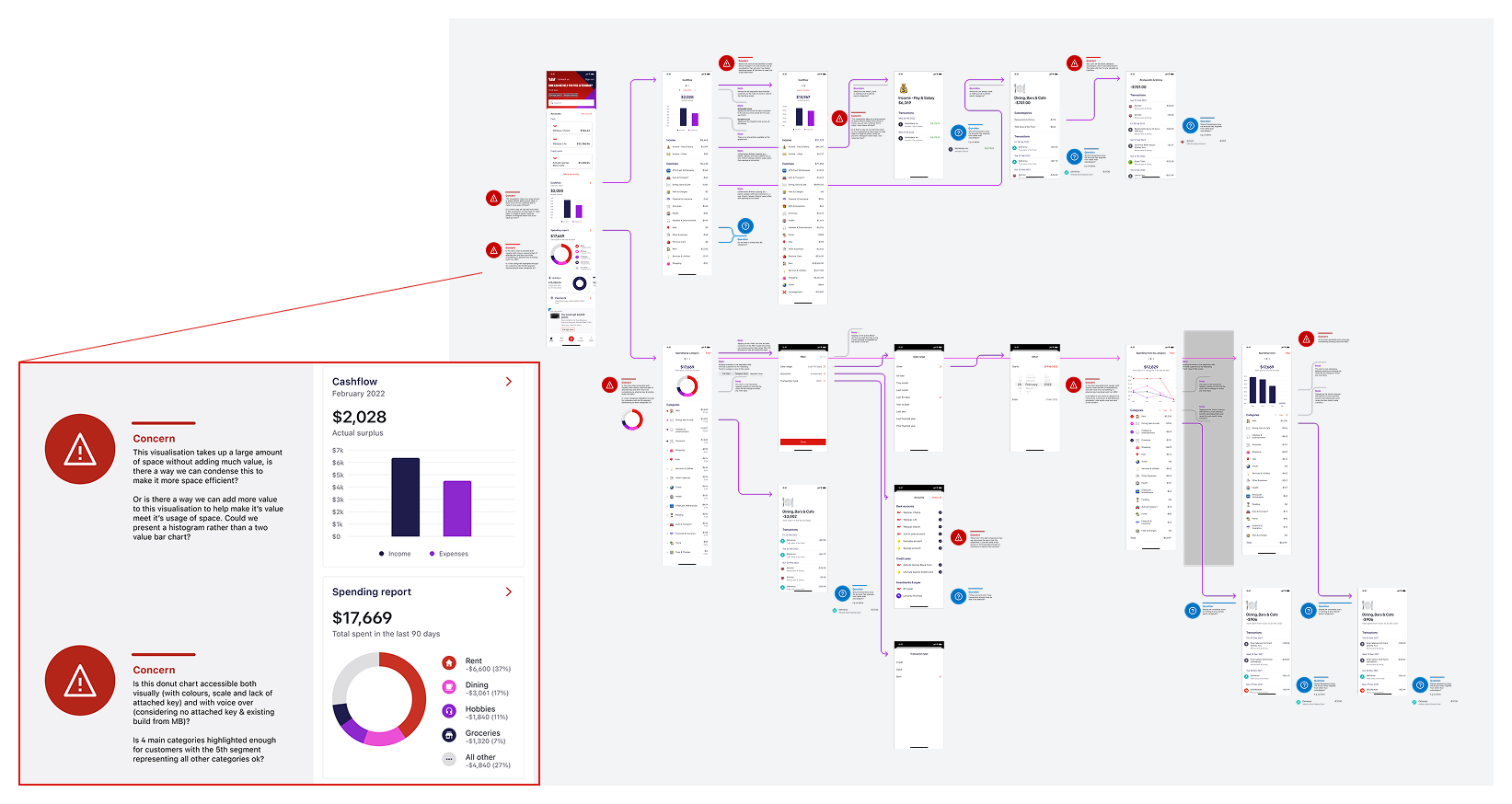
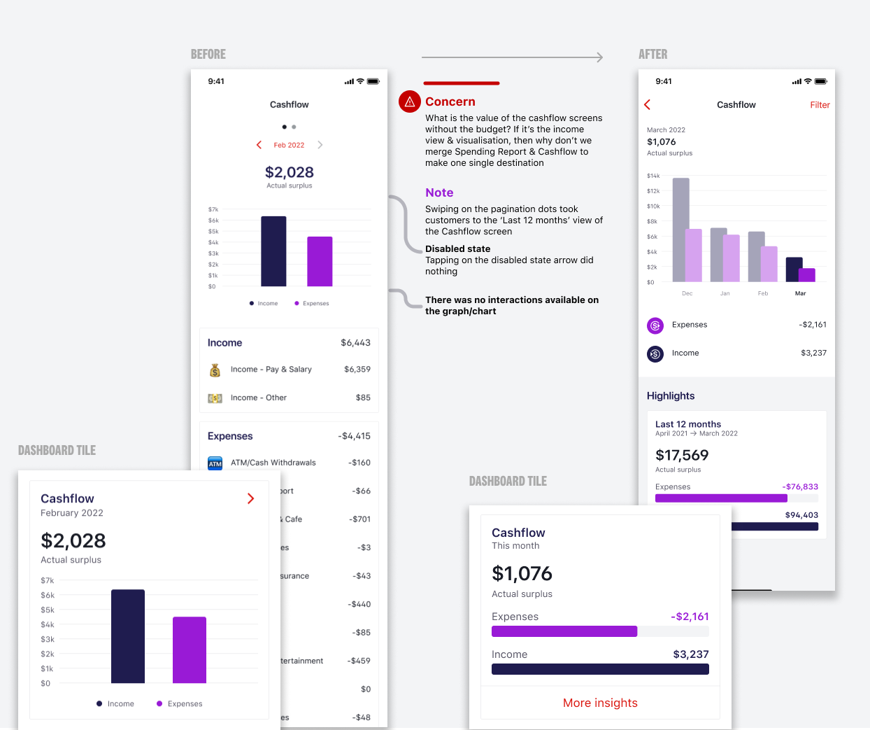
Cashflow became the starting point for customers trying to understand where their money goes. I designed it with clear visual hierarchy showing income versus expenses at a glance.
The challenge was serving both anxious beginners and financially savvy users without building separate experiences. I defaulted to a monthly view (simple, immediate understanding) while making quarterly and yearly views available through a filter. Users who wanted broader perspective could access it, but overwhelmed users weren't confronted with options they didn't need yet.
When working with engineering, we discovered the legacy system took several seconds to load transaction data. Rather than show a blank state that would make users think nothing was working, I designed the interface to show the chart structure immediately with a subtle loading indicator. The experience felt responsive even when the backend wasn't.
Spend tracking that adapts
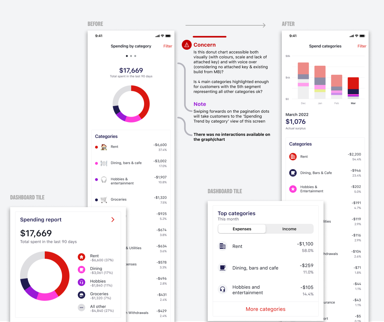
Spend tracking needed to serve two completely different use cases. Beginners wanted to see where their money went without feeling judged. Advanced users wanted detailed categorization and trend analysis.
I designed the interface to show high-level categories by default (groceries, dining, transport). Users could tap into any category to see subcategories and individual transactions. This progressive disclosure meant beginners got simple insights while advanced users could drill down as deep as they wanted.
The language was carefully crafted. Instead of "You spent $X on dining," we used "Your dining spending this month." Small shift, but it reduced the feeling of judgment that anxious users reported in testing.
Account aggregation without the complexity
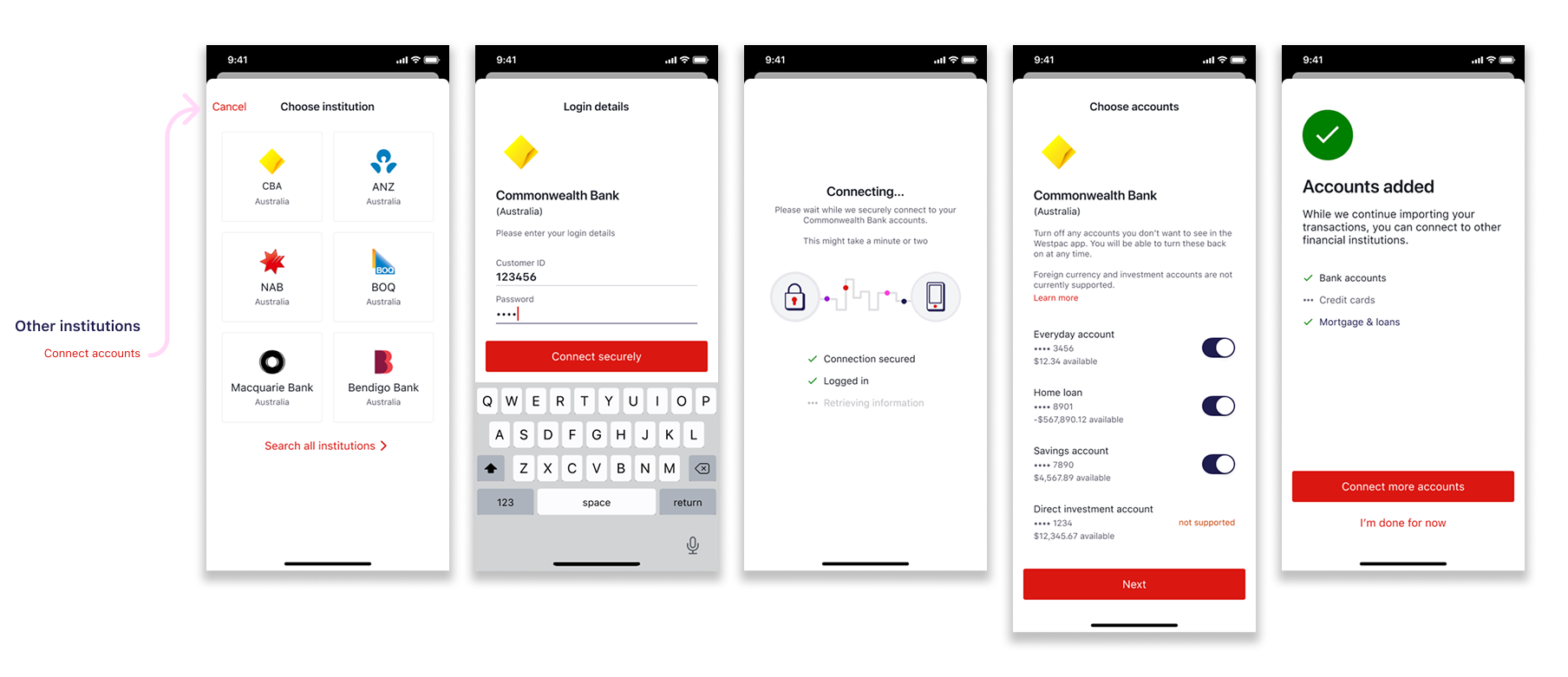
Account aggregation lets users link external accounts (other banks, credit cards) to see all finances in one place. This is powerful for proactive users managing multiple accounts but overwhelming for anxious users who barely understand their primary account.
I designed this as an opt-in feature rather than pushing everyone through setup. For users who did connect accounts, I made sure the interface clearly distinguished between "your money here" and "your money elsewhere" through visual hierarchy and labeling.
Security messaging was critical. Users needed to understand how their data was protected without being buried in technical jargon. We tested multiple versions of the security explanation and landed on simple language: "We use bank-level encryption. We can see your balances but never your passwords."
Testing with real customers
We ran usability testing sessions with 24 participants across our three personas. Each session included tasks like "find out how much you spent on groceries last month" and "connect an external account."
Key finding: Overwhelmed users needed more guidance than we initially provided. They didn't understand why they'd want to track spending or connect accounts. We added contextual tooltips explaining the "why" before asking them to do anything.
Surprising finding: Determined users loved the progressive disclosure but wanted faster access to advanced features. We added a settings toggle to "show all options" for users who wanted complexity upfront.
The testing validated our approach but showed we needed slightly more flexibility. The final design shipped with smart defaults AND the ability to customize the experience.
Launch and iteration
We launched in phases. Cashflow came first to validate the progressive disclosure approach. Spend tracking followed two weeks later. Account aggregation was the final piece three weeks after that.
This phased rollout let us learn and adapt. When we saw Overwhelmed users struggling with category names (what's "discretionary spending"?), we updated the language before launching spend tracking fully.
The metrics validated our approach. Monthly active users increased 36%. More importantly, engagement was strong across all three personas, proving we didn't have to choose between serving beginners or advanced users.
Results
Engagement
monthly active users (36% increase)
customers engaged with budgeting insights
Recognition
digitally active customers (5% YoY growth)
Australia (Good Design Award Winner)
Reflection
This project taught me that serving diverse users doesn't mean building separate experiences. Progressive disclosure, thoughtful defaults, and flexibility can create one system that adapts to different needs.
The hardest part was resisting the urge to show everything upfront. As designers, we're proud of our work and want users to see all the features. But hiding complexity behind simple defaults actually increased engagement because users weren't overwhelmed.
If I could do it again, I'd push for even more personalization. The "show all options" toggle was added late in the process. Building that flexibility in from the start would have saved iteration cycles.
Most importantly, this project demonstrated that financial wellness tools can be approachable without being patronizing, powerful without being overwhelming.