Product Strategy & Design that Drives Business Growth
Transforming critical business challenges in FinTech, B2B SaaS & Healthcare into trusted, market-leading products.
TRUSTED BY INNOVATORS AND INDUSTRY LEADERS


SELECTED WORKS
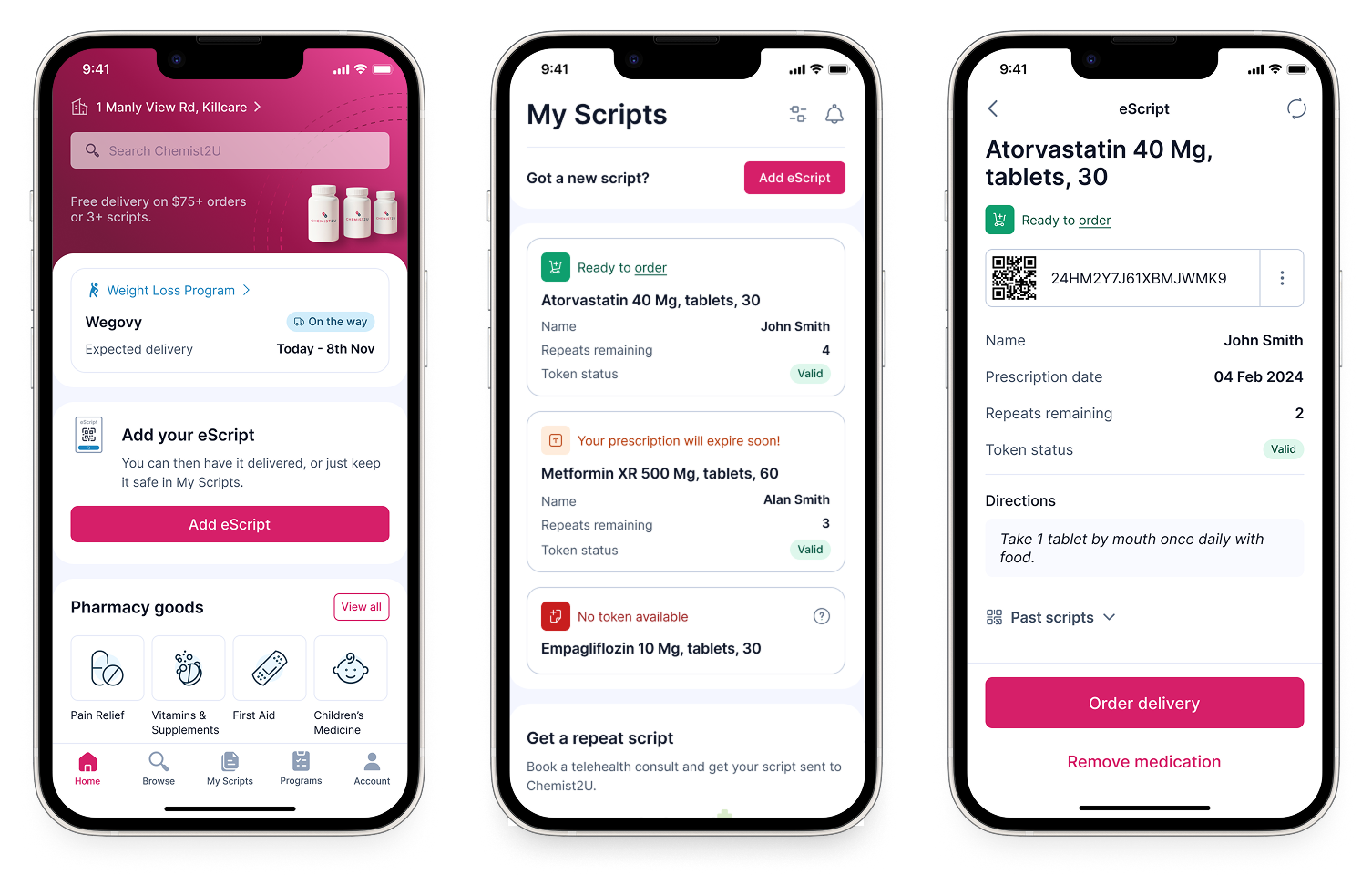
Healthcare Platform for Medication Management and Health Programs
Transforming a prescription delivery service into a scalable patient centric platform.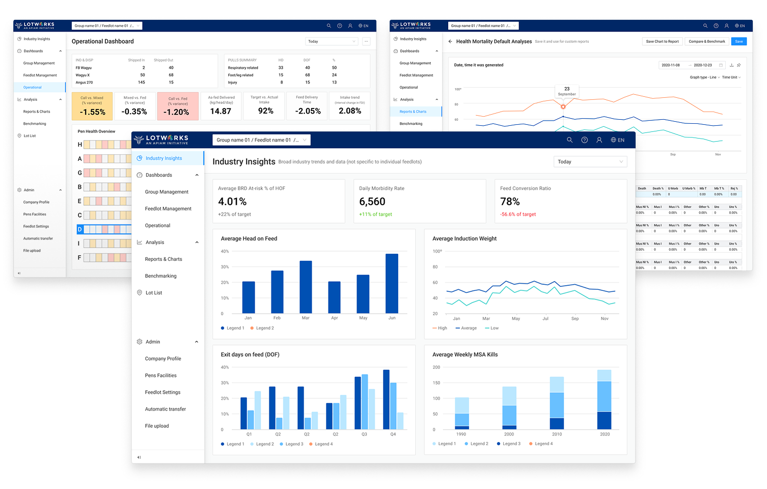
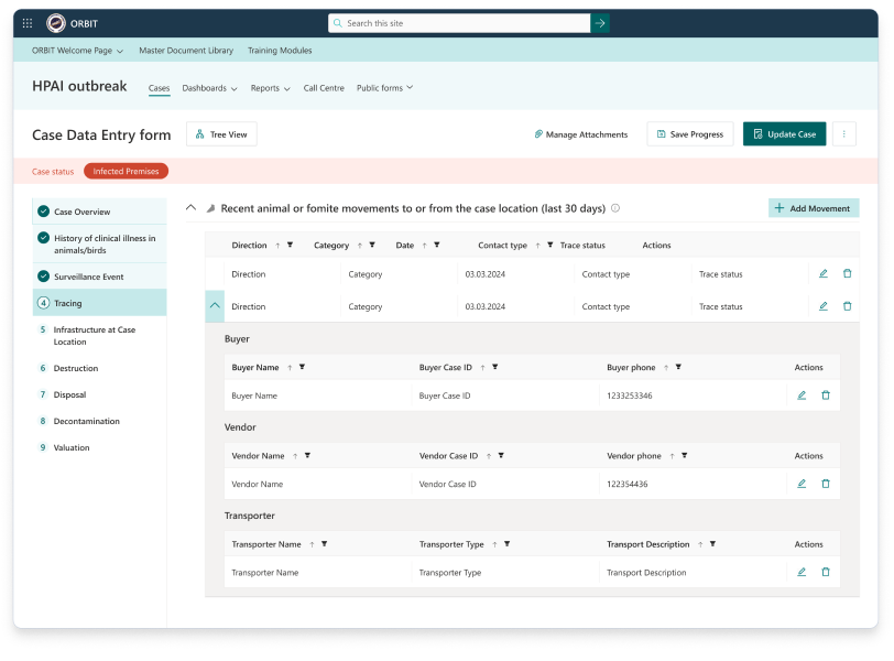
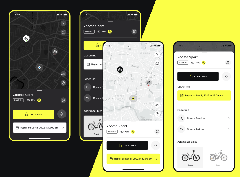
Livestock Feedlot Data Management
Redesigning a failing enterprise platform into a role-based system before clients walked.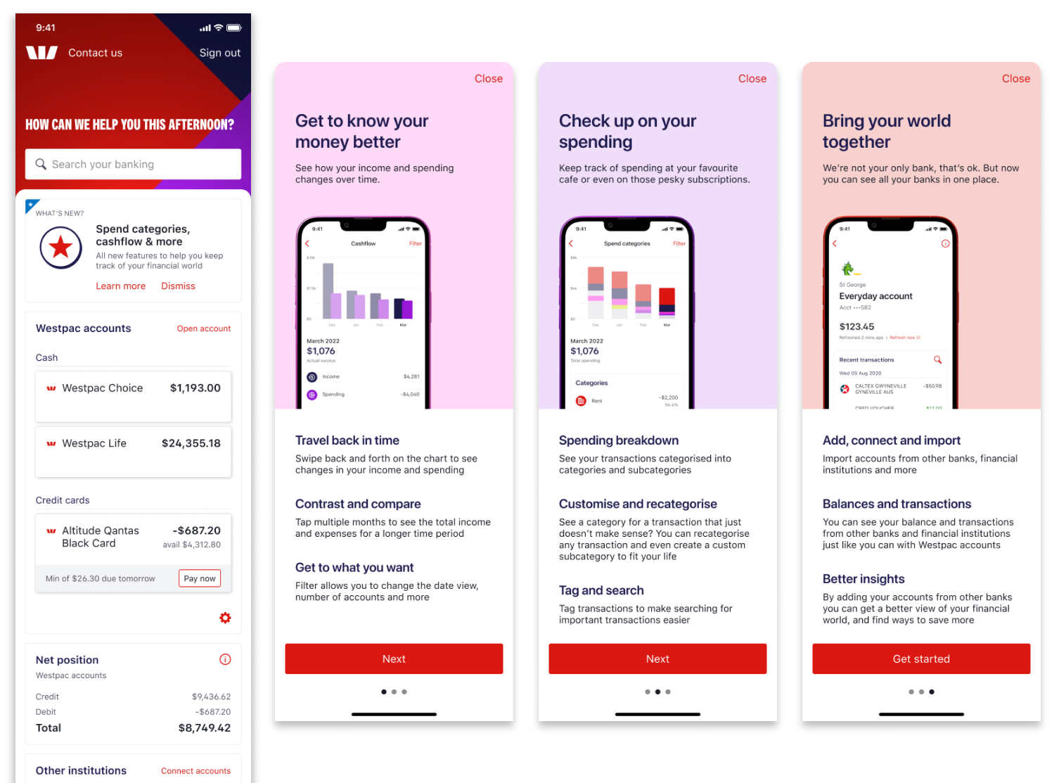
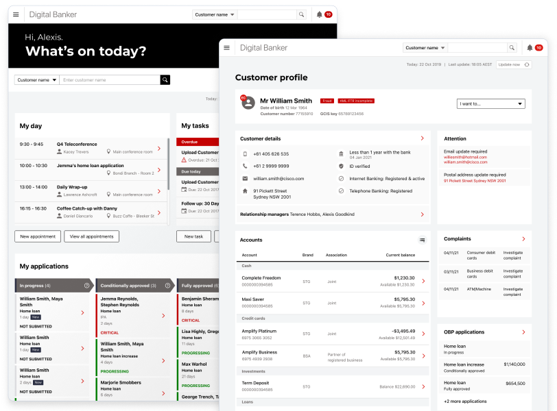
Financial Wellbeing for Enterprise Banking
Adapting money management features to different financial literacy levels without forcing everyone down the same path.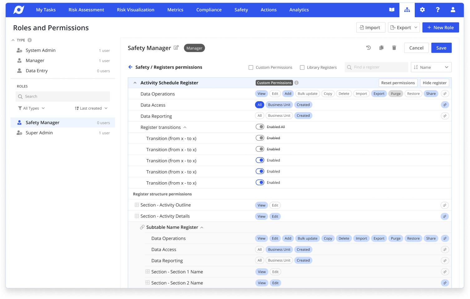
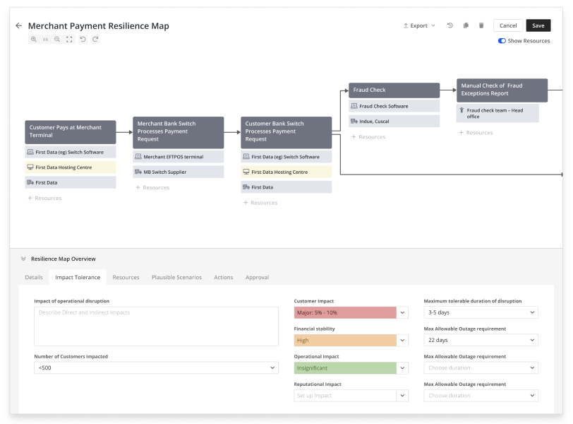
Enterprise Roles & Permissions Redesign
Cutting customer onboarding from 9 months to 2 months while migrating 3000+ permission configurations.TESTIMONIALS
"Talented and knowledgeable designer. No challenge was too much for her to tackle and her results were always of the highest quality."

Dr Jaimie Hunnam
BVSc MVSc MBA PhD
Senior Consultant
Ausvet Pty Ltd
"Incredibly innovative work in Banking and Finance products — more forward thinking than any other designer I've worked with."

Steven Ashby
Design Director
Block (formerly Square)
"Thinks strategically and gets things done well. Made complex problems feel manageable and transformed how our product works."

Tim Van Brugge
Co-founder & CTO
Chemist2U Australia
"Brilliant UX Product designer with two decades of international experience. Directly improved already commercially successful products."

David Levin
Head of Growth
A.Team
"One of the most exceptional professionals I have had the pleasure of working with across three different companies. We achieved great commercial results."

Claude Grignon-Galpin
Head of Product
BidOne Ltd., Hapara, 9 Spokes
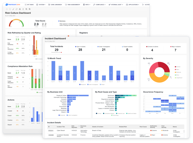
"Significantly improved usability of our complex system. Outstanding designs from concept to implementation, catalyzing organizational success."

Rhys Johnston
Head Of Development
Protecht Group
"Exceptional designer, knowledgeable problem solver, supportive teammate. One of the most mature and experienced design specialists."

Gerardo Dassi
Digital Strategy Consultant
ClearPoint
"Anna is an extremely mature professional who can hit the ground running very quickly. She understands business complexities and adds value to everything she does—from concept to live releases."

Sophie Stanley
Former Vice President USA at Figured
Co-Founder at Bounsa
OTHER PROJECTS
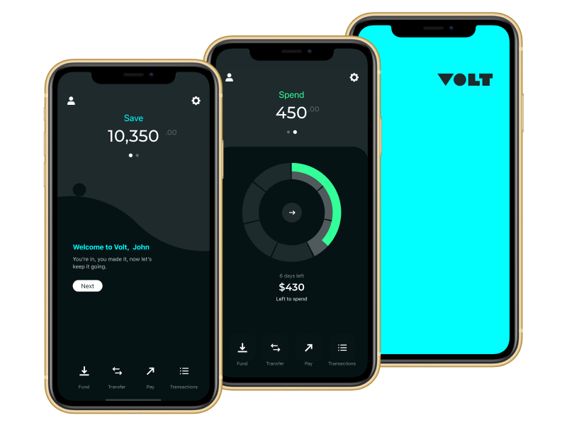
Volt Bank
Australia's first neobank
Open Banking Expo Awards Finalists
Best Open Banking Payments Implementation
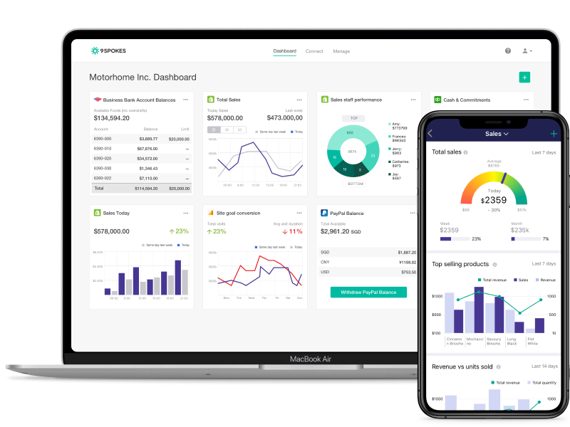
FinTech Platform for SMBs
9 SpokesOpen Banking Expo Awards Finalists
9 Spokes - Best App Proposition – Commercial
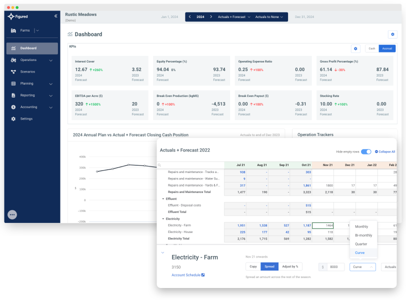
Agriculture Financial Management
FiguredAgTech Breakthrough Awards
Winner of the "AgTech Finance Solution of the Year"
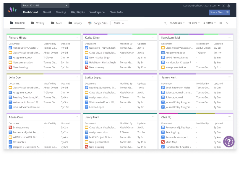
K-12 Classroom Management
Hapara
EdTech Digest's Cool Tool Award Finalist
EdTech Trendsetter by the EdTech Digest awards Finalist
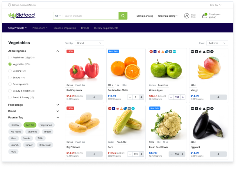
B2B E-commerce Platform
BidOne